
Bis dahin sind die Kommentare leider deaktiviert, außer für diesen Beitrag.
Bis dahin sind die Kommentare leider deaktiviert, außer für diesen Beitrag.
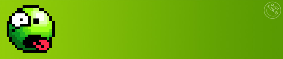
Damit hier auch wieder etwas Inhalt ins Blog kommt, möchte ich euch zwei Wildlife Smileys vorstellen. Nummer eins kommt aus Hamburg:


Nummer zwei ist auf einer Treppe in Palma, Mallorca, in der Nähe vom Hard Rock Cafe zu finden:


Wie angekündigt ist der Blog und das dahinter liegende WordPress nun wieder auf dem aktuellen Stand der Dinge. Ich bin schwer überrascht, dass meine WordPress-Installation nach so langer Zeit (ohne Updates) nicht einem Hack zum Opfer fiel. Außerdem bin ich äußerst davon angetan, wie sich WordPress weiter entwickelt hat.
In den nächsten Tagen, Wochen, Monate möchte ich alle Smilies vorstellen, die noch von der Zeit vor meiner Pause auf meiner Festplatte schlummern. Parallel dazu werde ich alte Zöpfe abtrennen und mich ausschließlich auf Smilies konzentrieren. Themen wie WordPress & Co werden in diesem Blog nicht mehr behandelt. Ziel ist es, den Fokus auf Smilies zu setzen!
Vermutlich werde ich auch das Layout entsorgen und auf den neuen WordPress-Standard setzen. Wundert euch also nicht, wenn es hier bald drunter drüber gehen wird was das Design des Blogs betrifft. Da aber bald Halloween ist, werde ich für den Anfang das alte Halloween-Layout aktivieren.
Der 30. Geburtstag des Smiley-Emoticon ist ein guter Zeitpunkt um wieder etwas Leben in diesen Blog zu bringen. Am Wochenende werde ich mir WordPress vornehmen und diesen Blog entstauben und auf Vordermann bringen. Die Geschwindigkeit in welcher die Seiten geladen werden, lässt arg zu wünschen übrig und einige Dinge funktionieren nicht wie gewünscht.
Bis dahin empfehle ich euch den Artikel „Smiley Lore ![]() “ von Scott E. Fahlman, in welchem er die Entstehung der beiden Emoticons beschreibt. Siehe außerdem, die Geschichte des Smilies.
“ von Scott E. Fahlman, in welchem er die Entstehung der beiden Emoticons beschreibt. Siehe außerdem, die Geschichte des Smilies.

Kenner wissen warum der Beitrag um 11:44 live ging!
Lange war’s ruhig hier im Blog und der Lappan-Verlag hatte mir das Wiederbeleben des Blogs nochmals einen Tick schwerer gemacht, aber man soll sich ja nie unterkriegen lassen. Für Ruhe im Blog war schlussendlich ich selber verantwortlich.
Genauso verantwortlich bzw. verantwortungslos war ich Weihnachten 2006, genauer gesagt am 24. Dezember 2006 als ich hier meine üblichen Adventkranz-Smilies vorstellte und ein Gedicht dazu stellte.
Ein teures Gedicht wie ich im Juli 2011 erfahren durfte, denn im Gegensatz zu allen anderen Beiträgen mit Gedichten fremder Autoren, hatte ich mich bei diesem Gedicht nicht um die Rechte daran schlau gemacht. Normalerweise achte ich darauf das der Dichter schon mehr als 70 Jahre tot ist, damit ist man hierzulande eigentlich auf der sicheren Seite.
Doch im besagten Falle war es ein Gedicht von Heinz Erhardt mit dem Titel „Die Weihnachtsgans“. Der gute Heinz, in meinen Augen deutsches Kulturgut, ist leider noch keine 70 Jahre tot („leider“ nur im Zusammenhang, dass dies nun mein persönliches Pech darstellt). Dementsprechend gibt es jemanden, der mit den Werken von Heinz Erhardt Geld verdienen möchte und dies ist der Lappan Verlag.
Über die Kanzlei KSP Rechtsanwälte erhielt ich dann auch ein freundliches Schreiben, dass ich eine Urheberrechtsverletzung begannen habe (den Autor hatte ich aber genannt, ich hatte mir also nichts zu Eigen gemacht!) und ich möge doch bitte Schadenersatz in Höhe von 726,90 Euro (inkl. aller Gebühren) leisten. Das Gedicht muss natürlich auch entfernt werden.
Ich hatte mich zwar mit KSP dann mit einer Zahlung von ca. der Hälfte geeinigt, genauso teuer war dann aber auch noch die Rechtsberatung durch meinen Anwalt. Müssen halt auch von was leben, die lieben Anwälte. Was man der KSP zu Gute halten muss ist, dass man neben der Schadenersatzforderung nicht auch abgemahnt hat. Beides wäre möglich gewesen. Wie auch immer, die Kanzlei macht ja nur ihren Job.
Was man dem Lappan Verlag aber vorwerfen muss ist, dass die Erbengemeinschaft das Vorgehen gar nicht begrüßte und ein einfaches Anschreiben an meine Person ausgereicht hätte. Im Gegenzug hätte ich auch was nettes über den Lappan Verlag geschrieben und das Gedicht natürlich entfernt, so bleibt ein fahler Beigeschmack und jeder kann sich sein eigenes Bild über dieses Unternehmen machen.
Auf boersenblatt.net gab es einen Artikel zu diesem Thema, in welchem es hieß:
„Dabei nehmen wir die 6.000 Fälle in Blogs und Foren jedoch aus“, betont Klaus Kämpfe-Burghardt, Geschäftsführer der Verlagsgruppe Ueberreuter, zu der Lappan gehört. Juristisch verfolgt würden nur die ca. 400 gewerblich genutzten Seiten.
Schade, bin wohl doch kein Blog bzw. muss das Börsenblatt sich wohl verschrieben haben, denn Herr Kämpfe-Burghardt schrieb mir:
… zu Ihren Zitaten zu meiner Person und die mir zugeschriebenen Zitaten nur so viel: Nicht immer hat man Einfluß auf das, was die Presse über einen schreibt, bzw. wie man zitiert wird. Gerichtsrelevant ist das aber nicht.
Zu Ihrem Verstoß gegen das Urheberrecht nehmen Sie Kontakt mit der von uns beauftragten Kanzlei auf.
PS: Weihnachtsgedichte für dieses Jahr sind gestrichen! ::P:
Ok, der Titel ist etwas irreführend, aber seit knapp einem Jahr habe ich nun außer den Zeitumstellungsposts nichts von mir hier hören lassen. Ich kanns selber kaum glauben… einen der Gründe gibt es aber gleich im Folgebeitrag!
Und nicht vergessen:

Das unsere Regierung diesen Unsinn mal abschafft, glaubt eh keiner mehr.
Krass, meine Pause hier im Blog überdauert nun schon eine ganze Periode Winterzeit (Normalzeit)! Eine weitere Phase (unnötiger) Sommerzeit soll die Pause nicht mehr einnehmen und so soll dieser Hinweis auf die heute stattgefunde Zeitumstellung, ein kleiner Vorbote auf ein GreenSmilies Comeback sein.
In diesem Sinne denkt daran, die Uhr eine Stunde vorzustellen!:

Für mich verfliegt die Zeit aktuell wie im Flug und selbst kleine, traditionelle Beiträge wie diesen zur Zeitumstellung finden keinen Platz. Ich hoffe aber sehr, dass deswegen keiner vergessen hat seine Uhr am letzten Sonntag um eine Stunde zurück zustellen.
Kann man nur hoffen, dass diese Sache mit der Zeitumstellung endlich abgeschafft wird.
Da ich schon Anfragen erhielt, ob es mir gut geht oder gar krank, tot oder was auch immer bin, mal wieder ein Lebenszeichen von mir! Gleich vorweg, ja, es geht mir gut, sogar besser denn je und nein, GreenSmilies macht nur Pause, nicht mehr und nicht weniger. Ich weiß, die Beiträge sind spärlich, aber ich hatte auch gute Gründe dafür.
Zum einen habe ich mich Anfang August unter’s Messer gelegt und mir eine kleine Schönheits-OP am Magen gegönnt. Um genau zu sein wurde eine Fundoplikatio gemacht. Hierbei wurde bei mir ein Zwerchfellbruch wieder zusammen genäht, der Magen, der zu weit nach oben gerutscht war, wird wieder zurück geschoben und obendrein eine kleine Magenmanschette mit einem Teil des Magens gemacht, damit auch alles fest dort sitzen bleibt, wo es bleiben soll.
Nach der OP muss ich sagen, ich ärgere mich, es nicht schon früher gemacht zu haben. Die OP wird per Endoskopie gemacht und war bis dato ein voller Erfolg! Kein Sodbrennen mehr, keine Magenschmerzen mehr und mein nerviger Husten scheint auch weg zu sein. Noch muss ich aber genesen und das kann noch 1-2 Monate dauern.
Essen war anfangs problematisch und ich war ziemlich groggy, mittlerweile geht es aber wieder steil bergauf – vor allem mit meinem Körpergewicht, von welchem ich anfangs fast 5 kg verloren hatte. Das hätte mal ruhig so bleiben können!
Eine weitere wichtige Änderung in meinem Leben ist mein neuer Job! War ich vor kurzem noch für die Uni Hamburg und in der IT bei Joeys Pizza beschäftigt, bin ich nun angehender Produkt-Manager bei der WHATEVER MOBILE Gmbh in Vollzeit. Der Job macht jetzt schon eine Menge Spaß und wenn ich mal richtig in der Materie bin, wird sich das sicherlich noch steigern. Bei Lösungen rund um SMS, Voice und Fax seid ihr bei mir richtig. :;):
Es wäre natürlich nicht ich, wenn ich am allerersten Arbeitstag nicht gleich einen Unfall mit dem Fahrrad gehabt hätte. Ein Auto aus einer Einfahrt fuhr mir dabei zu weit auf den Radweg und mein Ausweichmanöver scheiterte am nassen Kopfsteinpflaster und endete in einer Bruchlandung. Naja, ist nicht viel passiert und ich hoffe, die Versicherung übernimmt meinen kaputten Fahrradsattel, Blessuren an Hand, Knie und Ellbogen erledigt die Natur.
Auf der Heimfahrt von der Arbeit habe ich dann noch einen Wildlife Smiley entdeckt, mit welchem ich meinen Beitrag abschließen möchte:

Nachdem eine große, rote Hand als Waffe eines Ninjas nur beschränkt effektiv für die „üblichen Arbeiten“ ist, hier noch die beiden Ninjas von gestern mit einem Kurzschwert:


Ihr dürft auch weiterhin für Jojo voten.